Buttons and widgets
Notifications
The small popups that confirm "Added to wishlist" or explain why something didn't work.
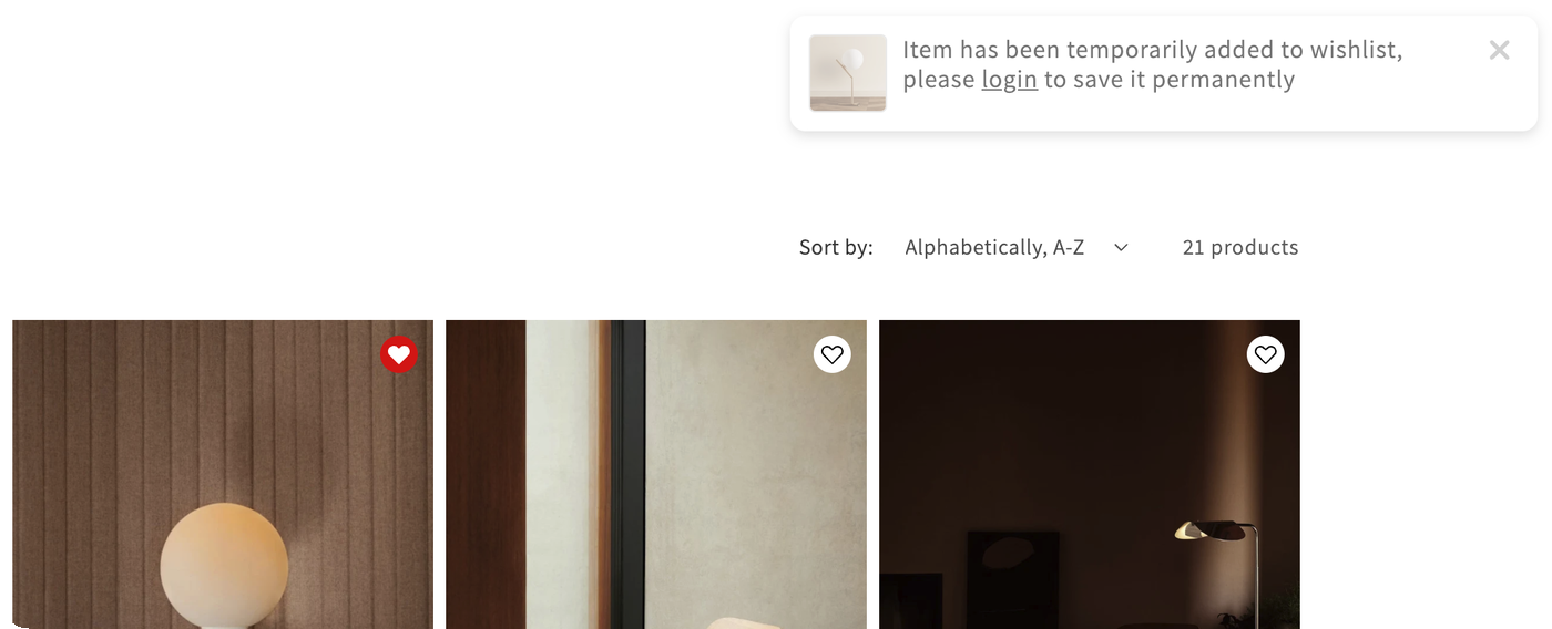
When a shopper saves or removes a product, a short popup confirms it. Errors show in the same place, in a different color, for example when a shopper needs to log in to use a feature.
Turn them on
- Open Features.
- On the Notifications card, tick Enable.
- Click Customize to open the editor.
If you open the editor while notifications are off, a banner reminds you to turn them on first.
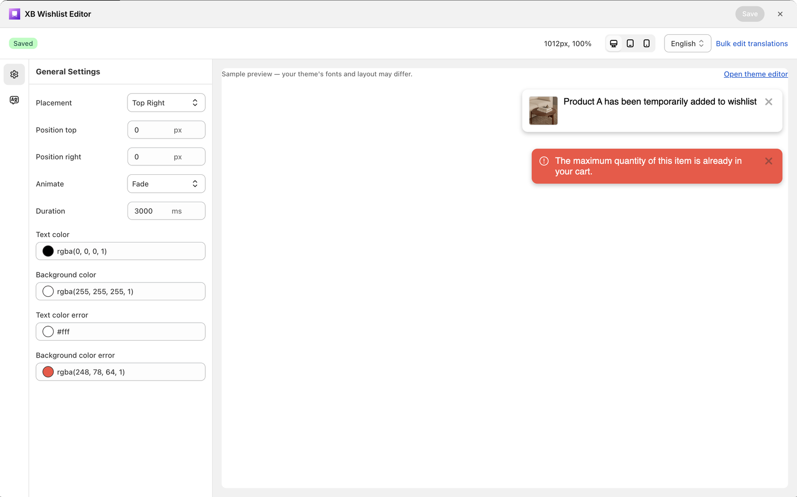
General settings
| Setting | What it does | Default |
|---|---|---|
| Placement | Top Left, Top Center, Top Right, Bottom Left, Bottom Center or Bottom Right | Top Right |
| Position | Distance from the edges of the screen, in px. Only the edges that match your placement are shown. | 20 px |
| Animate | How the popup comes in: Fade, Fade Up, Fade Down, Fade Left or Fade Right | Fade Left |
| Duration | How long it stays, in milliseconds (0–10000). 4000 is 4 seconds. | 4000 |
| Text color / Background color | Colors of success messages | #000 / #fff |
| Text color error / Background color error | Colors of error messages | #fff / red |
Change the wording
Open Language settings in the left sidebar of the editor. Every message is listed there: added, removed, errors and a few others. Pick a language from the Language selector at the top to write each message in that language.
To translate all messages at once in a spreadsheet, use Translations.
Still stuck? Email [email protected] with your store’s .myshopify.com address and we’ll set it up with you.