Buttons and widgets
Wishlist icon
Pick the heart, star or bookmark (or upload your own) once, and every wishlist button on your store uses it.
The Wishlist Icon settings are shared. Whatever you set here shows on the collection button, the product page button and the other places XB Wishlist draws an icon, so your store stays consistent.
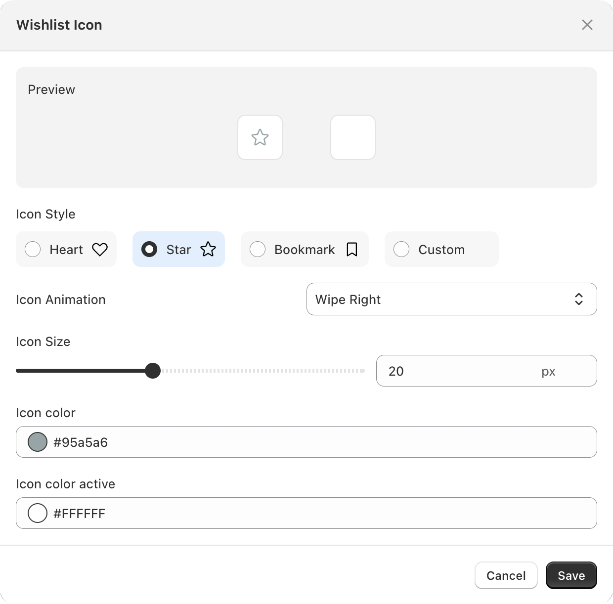
Change the icon
Open Features, find the Wishlist Icon card and click Customize. The preview at the top updates as you change settings.
| Setting | Options | Default |
|---|---|---|
| Icon Style | Heart, Star, Bookmark or Custom | Heart |
| Icon Animation | What happens when a shopper taps: None, Fill, Cross Fade, Scale Swap, Rotate Swap, Flip 3D, Slide Left, Radial, Wipe Right, Swing, Bounce or Flip | Fill |
| Icon Size | 1–50 px | 20 px |
| Icon color | The icon before it is saved | #ff4757 |
| Icon color active | The icon once it is saved | #fff |
Click Save to apply.
Use your own icon
Choose Icon Style → Custom. Two upload slots appear:
- Add icon: shown while the product is not saved yet.
- Remove icon: shown once it is saved.
Both must be SVG files. If an upload is rejected with "Only SVG files are allowed" or "Invalid SVG file", re-export it from your design tool as a plain SVG (not an SVG that wraps a PNG).
Give one button its own icon
The collection button and the product page button each have an Override Icon Style switch in their editor. Turn it on and that button gets its own style, colors, animation and size, while everything else keeps the shared icon. For example, use a filled heart on product pages and a smaller outline on cards.
Still stuck? Email [email protected] with your store’s .myshopify.com address and we’ll set it up with you.